


Tl;dr – this is the first collaboration palette of KHH, with the nature artist Carrie Rogers Art. We worked together to design the perfect palette for her, and… here it is!
This has been the work of three months discussing colours, making and sending paints and exploring colour mixing. And I’ve loved every second of it.
Carrie Rogers had a very clear vision in her head when starting out concepting for this palette: the woodlands behind her home in the spring, when the bluebells and other flowers begin to bloom. When she broached the subject to me, I instantly fell on love with the challenge.
Detailed below are the eight colours, and why they were chosen.
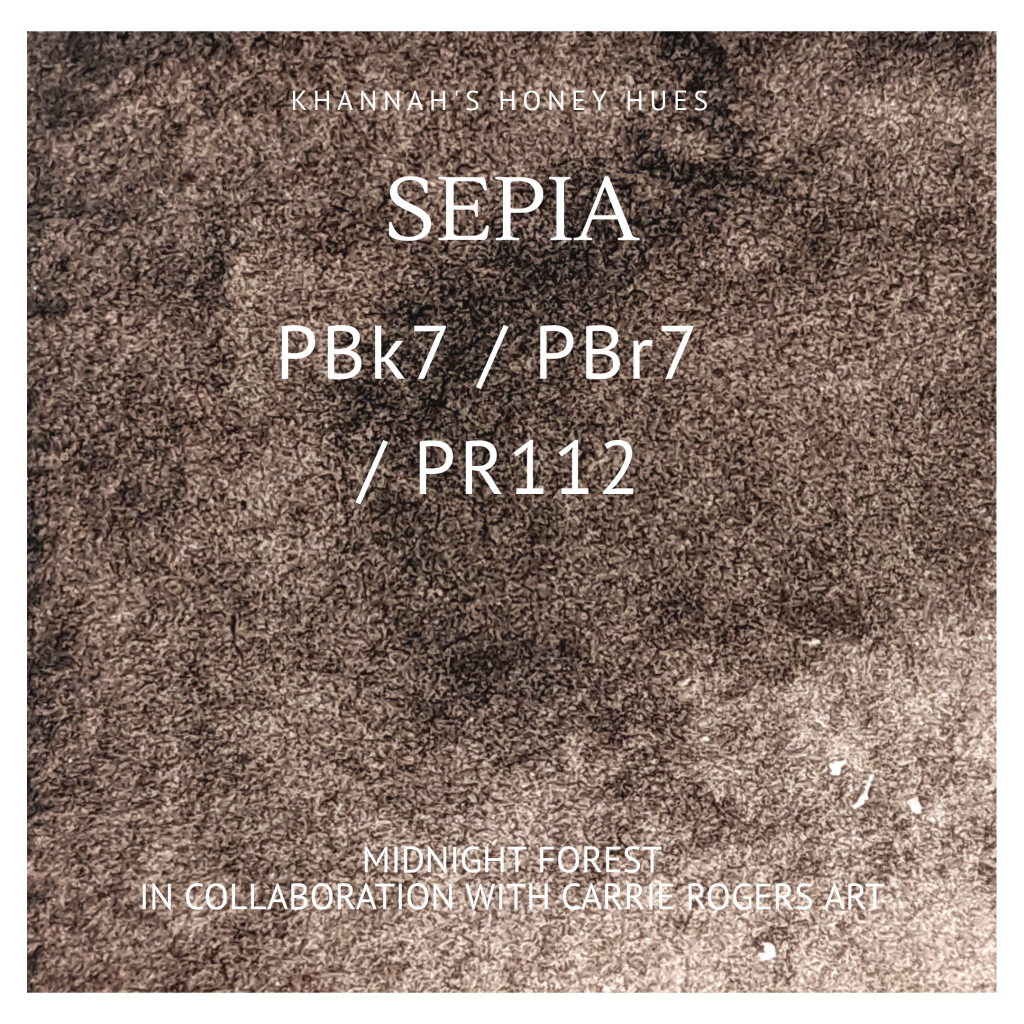
Sepia.
This is the warm neutral of the palette – it’s like the earth. This colour is perfect for shadows and other such items, and will add texture and depth to your pieces.
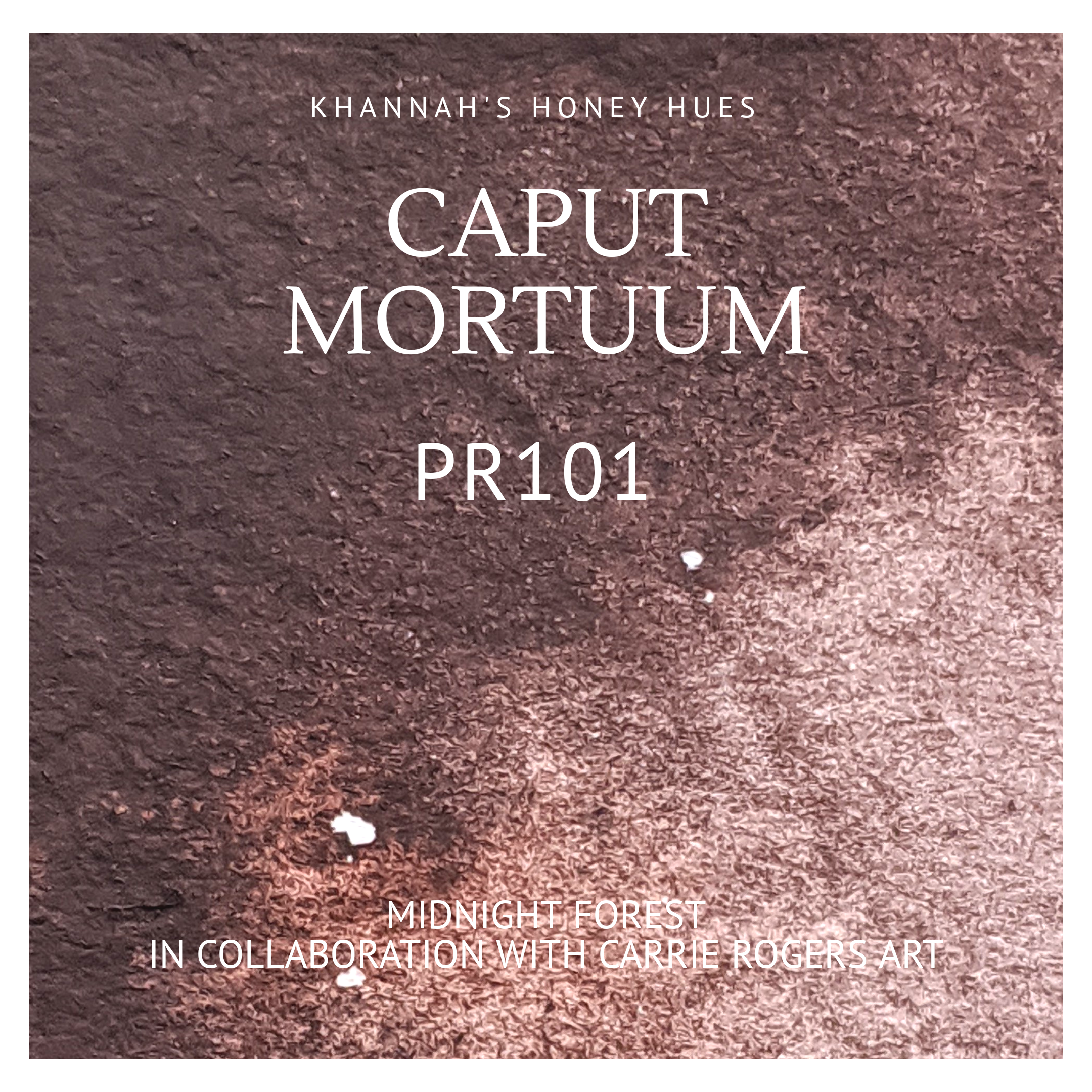
Caput Mortuum.
For this colour ,Carrie wanted a clay-like colour with deep dark tones and a versatile mixing component. She loves caput mortuum as a colour by itself too; it’s nice and rich and reminds her of the earth!
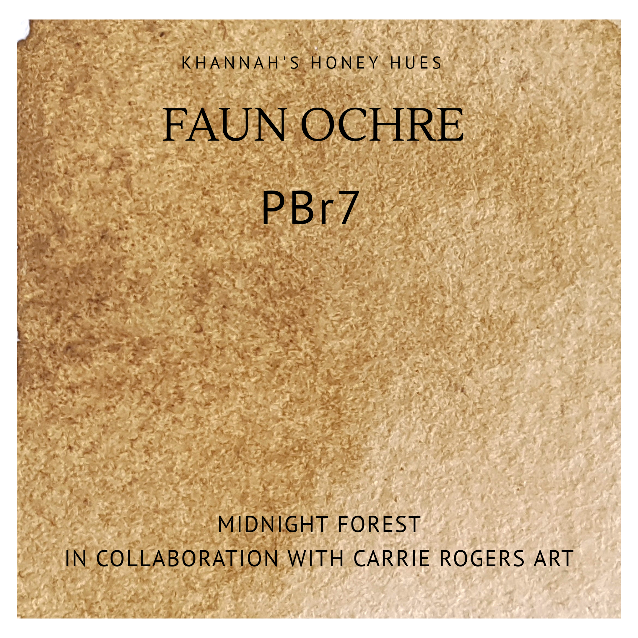
Faun Ochre.
This is the muted yellow tone for the palette. It’s a fabulous mixer, and we both love it so much. For Carrie, it was a colour she could use for barks and lichens, however it can also be mixed with buff titanium to make lovely mushroomy tones. It’s also an excellent mixer with evenfall moss to make a huge range of greens!!

Evenfall Moss.
This was originally a patreon-exclusive colour, but after Carrie saw it on my page she begged me for a sample. And the rest was history! It became part of my normal range, and Carrie decided it was a must for her palette.
It’s a beautiful deep earthy green that reminds her of the mosses and algae that you find on the forest floor.

Indigo Hue.
Whilst Carrie doesn’t often use blues in her work (it’s one of the lesser seen colours in nature), she wanted to include one in the palette to balance it out, and indigo hue is dark enough to make her happy, but also have a lot of mixing potential!
Mix this colour with evenfall moss and buff titanium and see one of Carrie’s top ten favourite mixes!!

Damson.
Carrie wanted to include in her palette a colour that would mix well with the others, but also make pinks/dusky hues without needing to include an actual pink. If you try to mix damson with caput mortuum, you’ll get a really lovely soft burgundy!
She might have also chosen this colour to paint one specific mushroom; the wood blewit. Mix damson with buff titanium and you get the perfect shade.

Buff Titanium
There are lots of things in nature that are pale, but not simply in the transparent way watercolours provide; this is where buff titanium comes in. It’s creamy hue adds warmth to any colour it mixes with, and it also shines on its own!
Buff Titanium is one of Carrie’s “necessity colours” – she can’t remember the last time that she didn’t use it!
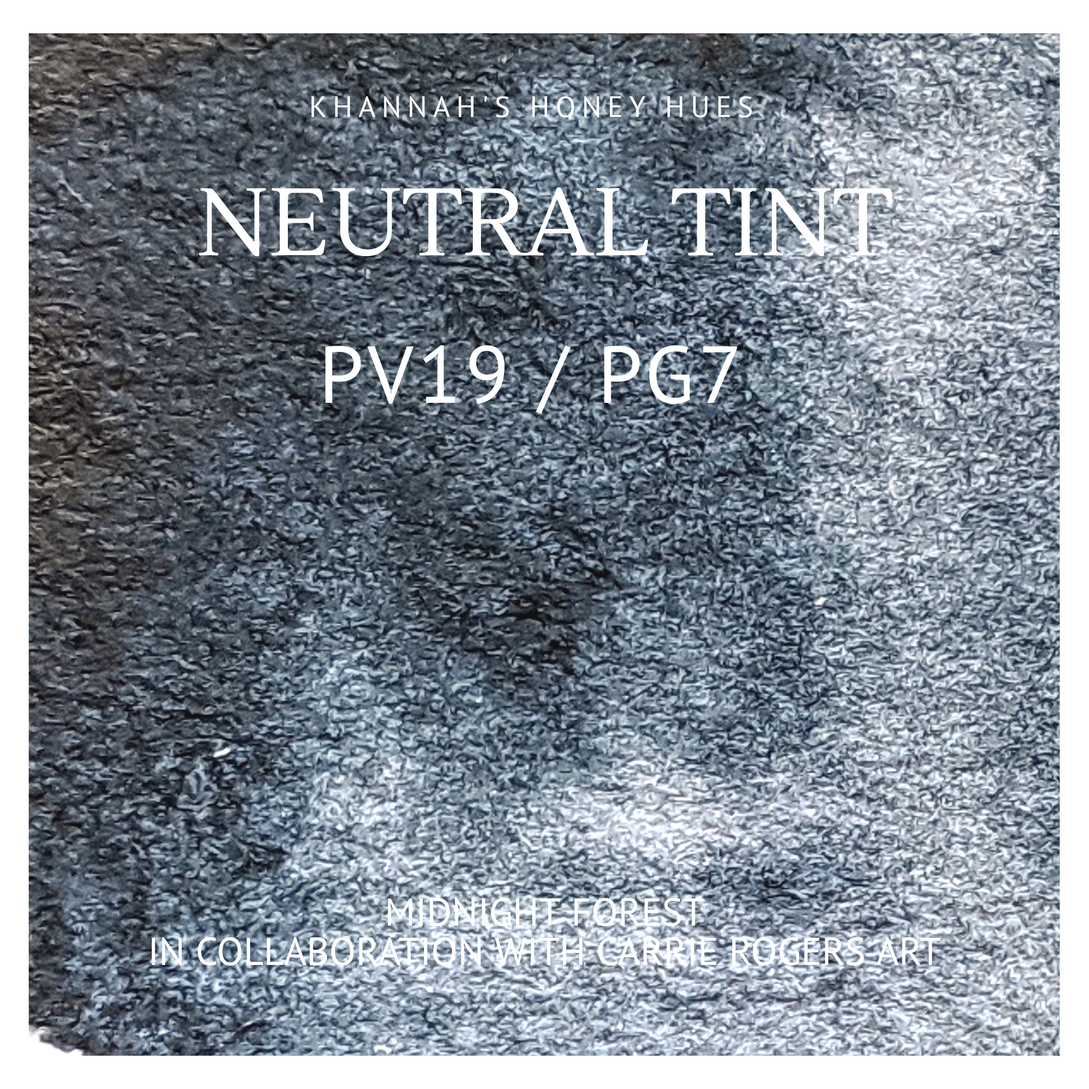
Neutral Tint.
This is quite literally the only essential colour I would have in a palette, and Carrie agrees, it being the other of her two necessessity colours. She uses it in almost all of her paintings as afor the shadows, as it darkens other colours without taking away the colour – exactly as a neutral tint should!
Carrie totally doesn’t have three pans of this colour. Nope. Not at all.
This palette was, to put it simply, a dream to make. Carrie was wonderful to work with, and we regularly exchanged happy mail, as well as swatches of potential colours so that we could match the paints made exactly to her vision.
Each of the limited edition palettes are in old cigar tins that Carrie found – they fit the vibe of the palette perfectly, in my opinion! There will also be some complete collections available, and if there is enough interest, I will offer singles of some colours.
I can’t tell you all the details yet, but in 2021 we are doing another, even bigger, collaboration!
I’d love to know what you all think of the colours on offer – which would you like to try? What would you paint with this palette?
Khannah
2 Comments
Kelly R. Wilson
I love the individual colors in this palette! But I’m in love with the different colors one can achieve when mixing them! So gorgeous, subdued, and moody in the most perfect way! Bravo!
khannahart
Awh thank you! It’s been such an amazing experience to make, and I adore playing with the mixes!