


Advent Calendar Preorders are now available! Dismiss
Updated May 2023.
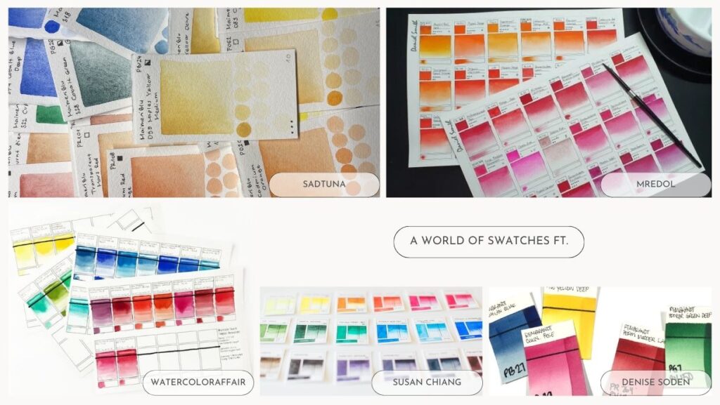
For many, the collecting of watercolours by different makers is as much a hobby as using the paints themselves. The excitement of waiting for your colours to arrive, organising them, and finally opening them up, ready to use.
I count myself among this number.
One of the greatest joys when receiving new paints is to swatch them out, test how they interact and compare them to similar paints in my arsenal.
As a paint maker, documenting the properties of my own paints is even more essential; I need to know how they act, in order to accurately inform my customers.
As an artist, knowing which colours have high or low staining helps inform the amount of each colour to use in mixes; lightfastness informs whether I want to use the colour in the first place; dispersion lets me know how much water I should use for washes.
Knowing how our paints act helps make us better artists.
Watercolours are unique in that pigment properties can lead to two visually identical colours acting completely different on paper. This is even more apparent when it comes to comparing brands (see this youtube series by Dr Oto Kano for prime examples). You may find that swatching and comparing two brands that you love how one version flows across the page, however the second gives a residue on opacity lines that you find unattractive.
Do you love the high dispersion of Qor colours, or prefer the greater control Holbein gives?
The only way to truly find out how each brand works is to swatch them out.
It is the key to knowing your paints, and lowers the barrier to using them.

The satisfaction of swatching out a new palette and seeing a beautiful rainbow of colours is often as relaxing and enjoyable as the painting itself; many (myself included) can spend hours curating their colours to perfect their collection.
Indeed, swatch cards can be incredibly aesthetic.
Caveat: take this advice with a pinch of salt. You might find you don’t need/want to have so much information in your swatch cards, and you simply want them for the colour. That is totally okay, and many people swatch their colours out on scrap paper to test for exact shades. Do what you feel comfortable with, and have fun.
It is essential to use waterproof ink if you want to keep your swatches clean and avoid ink smearing into the paint as you swatch.
I tend to use:
– Black sharpie for the thicker lines.
– Micron/fountain pen with platinum ink (or any waterproof pen ink) for thinner lines and writing.
(It is fine to use non-waterproof ink for the text; I prefer to keep to the same pens to avoid picking up the wrong one.)
If you are using a stamp to make your swatch cards, you also need to ensure that the ink you pair them with is waterproof.
KISS: keep it simple! If you don’t have a stamp or pre-printed cards, then you are going to be drawing a looooot of boxes.
For your sanity, make sure that your design is something you can easily repeat. You may end up with hundreds of swatches by the end of it!
If you have lots of colours to swatch, it might be tempting to get some cheap watercolour paper to save on money. I’d advise against this in general (card size dependent, see below); pigments can act very differently on cotton vs cellulose paper, or even between two brands.
By using the same paper as you do your art on, you can be sure to have the most accurate information on your paint.
I personally use 300gsm Saunders Waterford CP paper, which is 100% cotton in high white, and available at a reasonable price. For me, it’s worth the investment.
This is completely up to what you prefer; I use a 2.5 x 3.5 inch card as they fit perfectly into the plastic wallets I have, but there are plenty of different sizes out there. You might also decide to divide up a large piece of paper and keep your swatches “attached” rather than cut into individual cards.
You might only need a swatch of the mass tone, or a simple gradient. As you get more adventurous however, you might want to look into:
– Dispersion
– Opacity
– Staining/Lifting
– Granulation
– Mixes with Primary Colours
I specifically designed these cards to not use a lot of paint. My previous swatch cards were great for seeing masstone, however when I had only small samples of paint (I’m totally not looking at you, winsor and newton… schmincke…), the colours were a poor representation, looking washed out and unpigmented.
Additionally, I found that I was able to include more than one test in these modified swatch cards, and include all information essential to my painting.
1. Mass Tone
It is what it says on the label; a beautiful mass tone of the colour, shining out for all to see.
2. Graduated Wash, Transparency and Staining
Rather than doing a block colour here, I like to try and do a wash from mass tone to almost faded out. Sometimes these look really messy, and that’s okay! Different pigments behave in ways that aren’t predictable, and some colours really don’t want to do these fade out washes. It’s all part of the testing process.
To test transparency, you check the thick black line to see if there is any residue upon it.
For staining, take a clean, slightly damp brush (I prefer using a synthetic brush for this), and swipe it to try and ‘lift’ the paint, dabbing with a paper towel to dry. The easier to lift the paint, the less staining it is.
3. Dispersion
A visual test. Put a water wash over the box, then mix your brush with the colour. Dip it into the middle of the swatch area, and see the colours explode!
4-6. Granulation, Transparency, Staining Symbols
For these, I shade in the boxes. Granulation is either fully shaded, or not shaded at all (you could partially shade if you wished to do this too). The transparency square is shaded in more, the more opaque it is, and for staining, the more staining it is, the more the circle is shaded in.
7. Lightfasness
An essential attribute to consider when buying watercolours for commissions, as fugitive colours will fade in artworks exposed to the light. I usually test these separately, or use the pigment information given on tubes to help inform what I put there.
8-9. Paint/Brand Name
Paint names are not equivalent across brands however, and so it is often useful to have these noted. Alternatively, you could use these sections for further tests, such as glazing.
10. Pigments
No matter what a brand calls a colour, the pigment number will inform you of the true chemical composition. This is particularly useful when colours are marked as a “hue”.
You can find out the pigment information from the tube/packing of commercial paints. If handmade, makers often provide this information, but if you can’t find it, there is no harm in reaching out and asking them! 🙂
I’ve included a few examples of how I fill these out below. You can see where I have done the lifting, opacity, and dispersion tests, and how those tests have informed how I have filled in the information shapes.
The first card is of quinacridone pink, a highly staining but transparent colour. By contrast, manganese blue is heavily granulating, but lifts much more easily than the pink.
Wisteria, made with PV19 (a highly staining pink) and PB35 (a granulating, but low staining blue), gives a beautiful separation in the dispersion, where the violet spreads much more than the blue. Without making these swatch cards, I would have been unaware of the potential of this colour!

There are five ways to make your swatch cards; by hand, using stamps or a stencil, printing them out, or buying pre-made swatch cards. Each has their own pros and cons, so I’ll go into some of the details here!
| By Hand | Stamps | Stencils | Pre-printed | Bought |
|---|---|---|---|---|
|
Cheapest to make Can be as simple as you want Fully customisable |
Consistent look Quicker to make than drawing free-hand |
Consistent look Quicker to make than drawing free-hand |
Quick Only need to design once Completely customisable Consistent look |
No effort required Variety of designs available Supports businesses Consistent look |
|
Time consuming, tedious Hard to keep consistent Prone to human error |
Can appear patchy when using CP/rough paper Upfront cost Cannot customise |
Cannot customise Upfront cost |
High upfront cost (pigment-ink printers can cost over £100) |
Costly (depending on how many cards you need) More limited choice of watercolour paper |
If you like the look of the KHH swatch cards, I offer the above swatch card on a range of papers, and am happy to produce some in a watercolour paper of your choice, using pigment ink that is lightfast, and waterproof.
You may also want to think about having…
– A paper cutter or pair of scissors for cutting your cards
– Ruler
– Watercolour brushes (I use three for making these cards: a mop brush I use to lay out clear water, a (sable or squirrel) round brush for the swatching, and a synthetic round brush for the lifting tests)
– Two water cups (one for clean water, one for painty water)
– Paper towels (for the lifting tests, and general brush maintenance)
Again, this depends on the size of the cards you make. You could try…
Trading card/coin wallets.
Revision card storage.
Punching a hole in the top of your cards and hooking them on a keyring.


By Brand – This would work really well if you had your colours stored in little boxes – here is a cool tutorial by [] on how to make some custom boxes for a kallax unit.
By Colour – My preferred method, it allows me to compare the same colour in different brands. The images above show the swatches of my own-brand colours (click here to see a cool swatch gallery!), and showing them in chromatic order is super useful for seeing where there are gaps in my range, and if a new colour I’m working on is truly needed. It’s almost full already ^^’
Please note that some of the links provided in this article are affiliate links. It does not cost you any more to purchase through them, but I get a small commission, which helps me provide more content for you all. Thank you for your support.
One Comment
Pingback: